United Airlines will unveil an updated livery that chief executive Oscar Munoz calls an «evolution» in the next few months.
«It’s an evolution not a revolution,» he says on the sidelines of the US Chamber of Commerce aviation summit in Washington DC today. «I think it’s pretty cool.»
The Chicago-based carrier will unveil the livery update in the «April-ish» timeframe, adds Munoz.
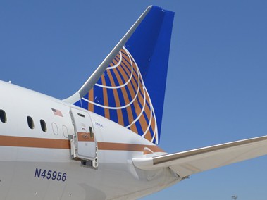
United uses an adapted version of the former Continental Airlines «globe» logo and livery that was designed by Lippincott and unveiled in 1991. Continental and United merged in 2010.
The current design features the «United» name in a blue sans-serif font on a largely white fuselage. A blue and gold globe adorns the tail.
Munoz says the update will incorporate some of the colours United has recently added to its branding palette that, for example, include the purple used for its new premium economy product and a new shade of blue dubbed «Rhapsody Blue».
One colour that is likely to feature less prominently is gold, which is currently used as a cheatline between the white upper fuselage and grey belly, and in the globe on the tail.
The design guidelines for United’s «Her Art Here» contest, where it invites female artists to submit designs for a Boeing 757, could include a clue to the evolved look. The «United» name is shown in a bold sans-serif font stretching from the top of the fuselage to below the window line, whereas currently it is limited to above the windows.
United will introduce its new look «in the course of normal business» as it takes delivery of new aircraft, and brings existing ones in for modifications and maintenance, says Munoz…